Light & looking
Choosing the cover image for an architecture project
A lead image should invite people in while representing the work faithfully. Use this quick review for a website, article or social post.
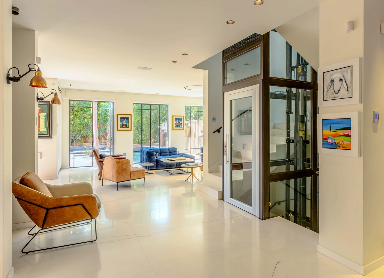
Begin with what the image promises
Set aside ‘Which image is the prettiest?’ for a moment. Ask what the viewer understands in the first second: the type of space, its connection to outdoors, its character or its scale. A good cover creates an expectation the gallery can fulfil.
Choose between a frame that explains the space and one that conveys atmosphere based on where it will appear. A project page may open with a wide view; a magazine feature may begin with a detail or the meeting of light and material.
Review the frame at different sizes
Reduce the image to a small card, view it on a phone, then open it at full width. Check that the subject remains legible and a square or horizontal crop does not remove an important architectural line. Do not rely on one automatic crop for every channel.
If a crop is needed for a particular placement, prepare a separate cover version and keep the complete photograph available. A mobile cover can also differ when the main subject does not survive reduction.
Check accuracy and context
Make sure the frame does not conceal a limitation viewers need to know, and that finishing keeps geometry, colour and material believable. A dramatic cover can invite attention; it should not imply that the place is different from what it is.
Write alt text that briefly describes the image and project. It should help someone who cannot see the photograph understand what is shown, rather than pack in search terms or guess at details that are not visible.
Run a quick selection test
Show two options to someone unfamiliar with the project and ask: ‘What do you understand about this place, and which image makes you want to see more?’ Their response is not an absolute measure, but it may reveal a beautiful cover that is unclear or an informative one that does not invite curiosity.
Record where the image will be used, who approved it and the correct credit. Covers shared across a website, media and newsletter build recognition when they stay faithful to the same project and story.
A CONVERSATION ABOUT THE PLACE
What stayed with you?
Thoughtful responses are welcome. Every comment is reviewed before it appears publicly.