Material & time
Colour that stays true to a place
A practical workflow for balancing atmosphere, mixed light and real materials without turning a space into something it is not.
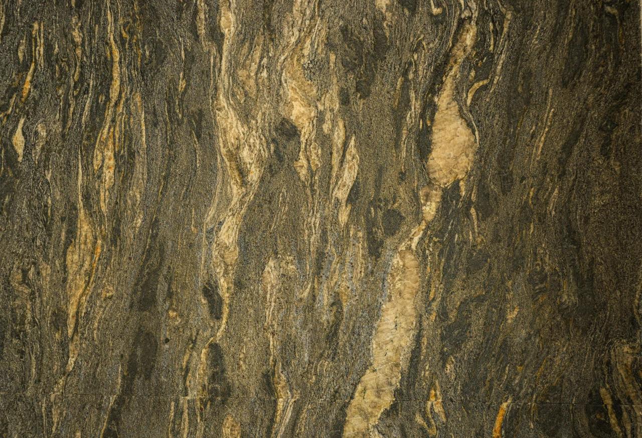
Decide what faithful colour means
Colour fidelity does not mean every screen will look identical. It begins with knowing the place: the tone of the wood, the way a wall responds to daylight and the relationship between window light and lamps. Ask the project team what must remain recognisable, and record the answer before editing.
Photograph a grey card or colour target on location when accurate matching matters, and keep the source files. Review on a calibrated display where possible, while avoiding promises of perfect consistency on every phone. The aim is considered, repeatable decisions, not control over the viewer’s device.
Manage mixed light before editing
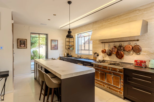
A room may combine cool daylight, warm fixtures and colour reflected from a wall or garden. Before filming, check whether a fixture creating an unwanted patch can be switched off, or whether a different time offers a more comfortable balance. Not every source needs the same colour if the contrast belongs to the place.
When photographing several views, keep white balance and exposure settings consistent where possible. Make adjustments across the sequence in response to the space, rather than trying to make every wall pure white. Consistency helps readers move between images without losing their sense of the home.
Edit gently and review the sequence
Begin with corrections that restore information: exposure, white point, colour balance and contrast. Then check saturation, skin tones and reflections. If stone turns orange, greenery glows in a way it did not on site, or a window becomes blue, step back. Convincing finishing leaves room for material to look like material.
Do not review only one frame. Place the full series together, view it on another display and return after a break. Ask whether the room still feels like the place you visited and whether changes in light remain believable. Accurate colour need not be cool; it can be warm when that warmth belongs to the place.
A CONVERSATION ABOUT THE PLACE
What stayed with you?
Thoughtful responses are welcome. Every comment is reviewed before it appears publicly.