Place & feeling
Marketing images or portfolio images? Start with the purpose
One space, two different jobs. Match the selection, sequence and captions to the audience and use without inventing claims.
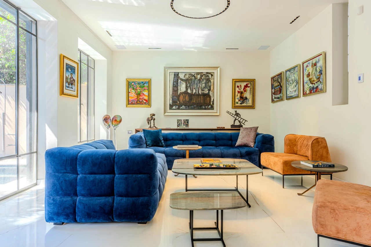
Define the audience before selecting an image
Photography used to market a property should help prospective buyers understand the space, how rooms connect and what gives it character. An architecture or interior portfolio should also reveal the decisions that shaped it: planning, material junctions, proportion and light.
Write one sentence for each use: ‘The viewer should understand…’. If those sentences differ, you may need different selections from the same shoot, even when a separate production is unnecessary.
Show the right evidence for each story
For marketing, include views that explain the space and help people orient themselves: arrival, main living areas, the connection outdoors and relevant features. Show only what is actually there, and make factual details accurate when they matter to a buyer.
For a portfolio, build a sequence that clarifies what is distinctive about the project. Combine a wide view with frames that show transitions, relationships and material or joinery details. A short piece of context can help viewers read the design without assuming they know its process.
Edit channel versions from full originals
Choose a lead image for each purpose, then make a concise sequence for every channel. Give each image a role and remove repetition. Prepare crops for cards and social formats from the original, while retaining a complete version for full-size viewing and publication.
A useful caption can go beyond the room name. It may credit the designer, architect and photographer, or identify materials and a design idea — once credits are verified and permission is in place. Property marketing should avoid unchecked facts or language that implies a feature the home does not have.
A five-minute pre-publication check
Review the material on a phone and a wide screen. Check that the lead frame is clear, the crop keeps important details and the sequence still makes sense without captions. Verify names, addresses, credits and usage permissions.
Keep a delivery folder with approved versions, dimensions, captions, credits and permitted channels. This makes it easier to reuse the work over time without reopening every question for each publication.
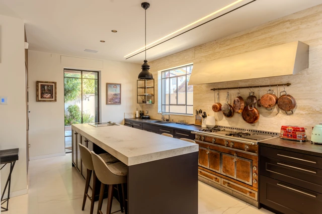

A CONVERSATION ABOUT THE PLACE
What stayed with you?
Thoughtful responses are welcome. Every comment is reviewed before it appears publicly.